Company
Jun 16, 2023
How We Roll – Chapter 5: Customization
James Perkins
How We Roll is a deep dive into how Clerk implements authentication. This chapter covers the various ways developers can customize Clerk's UI components.

Welcome to How We Roll! This series is meant to help product owners, developers, and security professionals understand exactly how we implement (or, roll) authentication at Clerk.
Chapter 5: Customization
When you build your brand, you spend hours making sure every color, font, and logo is exactly how you envisioned. When you integrate with a 3rd party product like Clerk, you want to make sure that your brand shines. Clerk empowers developers by offering:
- Highly customizable components
- Custom flows
- Themes for our hosted pages
In this chapter we are going to be talking about how to customize our drop-in components and why we wanted to treat it as a first class experience. Grab a drink and enjoy a deep dive into our appearance property.
Clerk’s Appearance Property
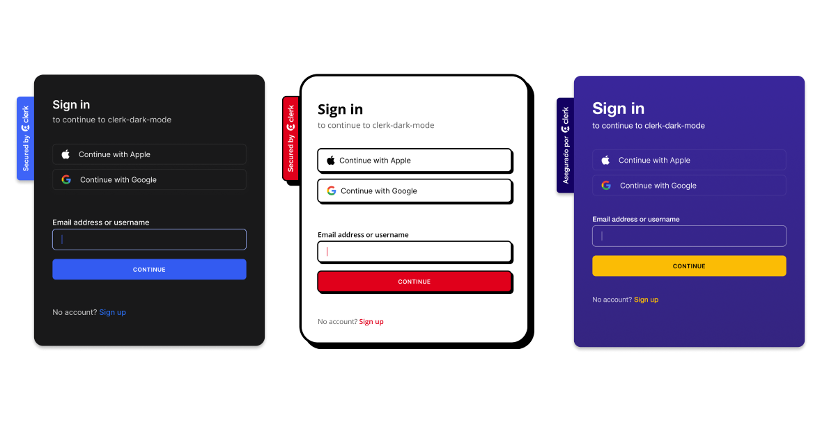
When Clerk introduced customization, we wanted something that wasn’t an afterthought where only minimal items could be changed, like buttons or primary colors. We wanted developers to go as deep as required, and the appearance property allowed this by letting developers:
- Have access to entire themes, like dark mode, and the ability to create a custom theme
- Control the layout
- Have global control of the appearance
- Customize individual components
- Inherit from key branding like fonts, and element sizing
- Integrate with their current CSS method of choice
Base Themes
The baseTheme allows a developer to create a theme for your brand, and can be reused across multiple projects. We provide a package called @clerk/themes that allows you to use prebuilt versions that were crafted by Clerk, like our dark theme or shades of purple:
import { type AppType } from "next/app";import {ClerkProvider} from "@clerk/nextjs";import { dark } from "@clerk/themes"const MyApp: AppType = ({ Component, pageProps }) => {return (<ClerkProvider appearance={{baseTheme: dark}} {...pageProps}><Component {...pageProps} /></ClerkProvider >);};

Controlling the Layout
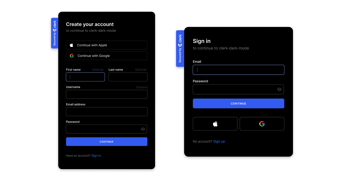
The default layouts for Clerk’s sign in and sign up components show the social buttons at the top, with other forms of authentication, like email, below. In similar fashion, when a user signs up for your application, by default, we show the optional fields. For some applications this makes sense, for others, not so much.
This is where our layout property can be used. Developers can move social providers, change the default look of the social buttons, hide optional fields, show links to help, privacy policy, and terms and conditions pages, and much more:
<ClerkProvider appearance={{layout: {showOptionalFields: false,socialButtonsPlacement: "bottom",socialButtonsVariant: "iconButton",helpPageUrl: "/help",privacyPageUrl: "/privacy",termsPageUrl: "/terms"},}} {...pageProps}>

Global Customization
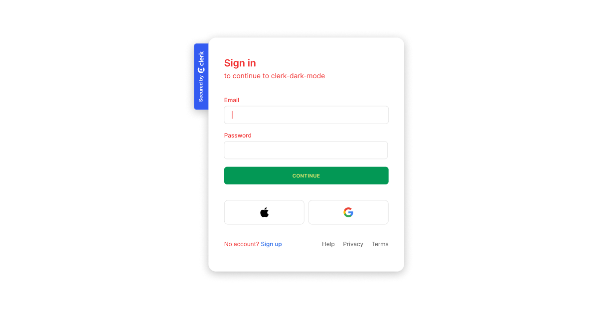
Not every application needs its own theme; it is possible to extend the Clerk baseTheme to fit with an application. Examples include globally setting some of the attributes, such as every primaryButton element having a green background and the text inside being yellow, or setting all text colors to the company’s brand color.
All of this can be done at the ClerkProvider level, allowing developers to speed up the customization of our components:
<ClerkProvider appearance={{elements: {formButtonPrimary: {backgroundColor: "green",color: "yellow"},},variables: {colorText: "red"}}} {...pageProps}>

Individual Components
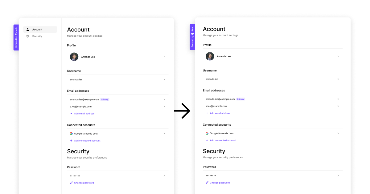
Applications are built of components, and individual components may need to be styled in a specific way. For example the Clerk <UserButton /> might be too small for your sidebar or navigation bar, or the <UserProfile/> may not need to show the sidebar.
You can apply the appearance property directly to individual Clerk components:
import { UserProfile } from "@clerk/nextjs";export default function Profile() {return (<div><UserProfile appearance={{elements: {navbar: {"display": "none"}}}} /></div>);}

Elements and Variables
We’ve talked a lot about the parts that make Clerk customization a first class experience, but the powerful parts are variables and elements. Whether you are globally styling or styling individual components, variables and elements are essential.
The variables property is used to adjust the general styles of the base theme, like colors, backgrounds, typography:
import { ClerkProvider, SignIn } from '@clerk/nextjs';import type { AppProps } from "next/app";function MyApp({ Component, pageProps }: AppProps) {return (<ClerkProvider {...pageProps} appearance={{variables: {colorPrimary: "red",colorText: "white"}}}><Component {...pageProps}/></ClerkProvider>)}export default MyApp;
The elements property is used for fine-grained theme overrides, and is useful when styling specific HTML elements. You can find the element to target by inspecting the HTML and looking for the class name.
Summary
Clerk allows for extensive customization when integrating with third-party products, ensuring brand elements are upheld. Developers can customize individual components, control the layout, modify the global appearance, create custom themes, and adjust the style of base themes through the appearance, baseTheme, layout, variables, and elements properties, ensuring the brand's unique design and user experience are reflected in every interaction.
For an in-depth look at how to leverage the full power of customization with Clerk, check out the Component Customization docs.
How We Roll Series Index
- How We Roll – Chapter 1: Passwords
- How We Roll – Chapter 2: Avatars
- How We Roll – Chapter 3: Multifactor
- How We Roll – Chapter 4: Email Verification
- How We Roll – Chapter 5: Customization
- How We Roll – Chapter 6: User Profile
- How We Roll – Chapter 7: JWT Single Sign-On
- How We Roll – Chapter 8: Sessions
- How We Roll – Chapter 9: Infrastructure
- How We Roll – Chapter 10: Roundup
Start now,
no strings attached
Start completely free for up to 5,000 monthly active users and up to 10 monthly active orgs. No credit card required.
Pricing built forbusinesses of all sizes.
Learn more about our transparent per-user costs to estimate how much your company could save by implementing Clerk.
Newsletter!
The latest news and updates from Clerk, sent to your inbox.